Project Grid
Multi-platform data visualization system extending the Competitiveness Outlook design language. Built unified theming architecture using design tokens and monorepo structure for backwards compatibility.

A functional layout system for terminal applications built with Effect.js. Create TUIs with composable boxes, ANSI styling, and reactive components.

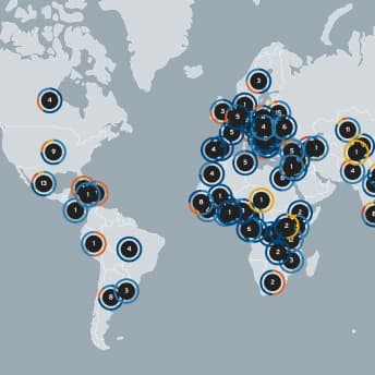
Interactive map of global plastic pollution data for IPEN. Built fullstack app using Next.js, PostgreSQL, and D3. Designed map interactivity and backend filters for dynamic loading.
- German Design Awards 2026: Excellent Communications Design Web
Data exploration dashboard using React and D3 to visualize cancer trends in Switzerland. Implemented filtering logic, tooltips, and accessible UX patterns.

- Swiss Viz Award 2025: Silver in Operational Insight
- German Design Award 2026: Excellent Communications Design Web
Interactive data storytelling platform built using fullstack technologies. Created backend logic for scoring systems and visual data transitions.

Localized schedule builder using micro-frontend architecture. Next.js frontend with modular deployment. Backend powered by Supabase + PostgreSQL.

Interactive map of migration initiatives in Niger. Built with Next.js and MapLibre, integrated with IOM's CMS for real-time updates.

Data visualization of critical aspects of the current and past discourse around urban sustainability in Zürich.


App for the full lineup of speakers for the Outlier Conf, Feb 4-5th 2022


Designing the UI and UX for a plant care app. Taking sensor data and ML to create house plant recommendations.
DESIGNDEVELOPGARDEN

Development history of the open hardware project based on the mimirHome sensor. How the project evolved from a breadboard to a fully integrated PCB.

Visualizing Tasty Vietnamese Food from Coming Soon. Using data to create a large printed visualization for a local restaurant.

Data Visualization exploring the complex relationship of plastic and its recycling system.


Garden designed to be a self sufficent and abundant ecosystem in Spain
DESIGNGARDEN
