As part of my internship at Interactive Things, I worked on developing an interactive data visualization as a final graduation project. I was responsible for the collecting data, designing and developing the visualization. I initially started with the idea to explore how recycling in Switzerland works and see what sorts of data I could find.
While the early design stages of the project followed a similar double-diamond design process, I'm presenting here the final iteration of ideas and how they came together.
Data Collection
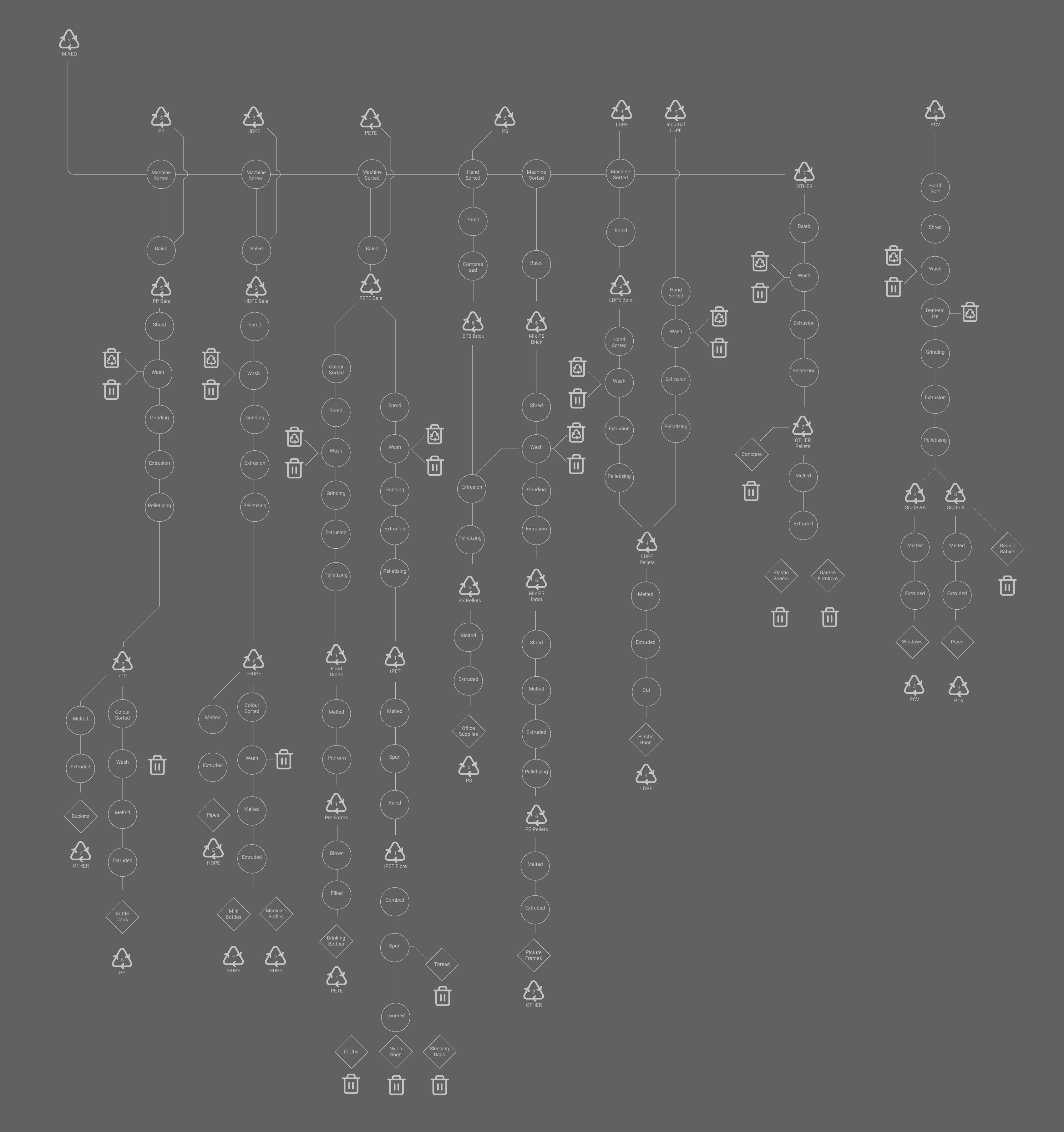
The data was collected through several interviews of various stakeholders in Switzerland's recycling system. Initially this included multiple waste streams such as glass, paper, and aluminum. However, as the project progressed, I decided to focus on plastic as it was the most interesting and complex material to work with. Through research and refinement, I was able to build these flow charts of how each type of plastic is recycled as the various materials and products it can be turned into.

There are 6 flow charts in total for the 7 types of recyclable plastics (OTHER didn't need a flow chart). Depending on the types of facilities available in the country,greatly effects the materials that possible to be produced and thus result in more plastic being able to kept in the system
Visualization
The initial design of the visualization was a combination of all of the flow charts, showing the complete web of interconnected materials and products that plastic can be turned into. What was interesting about this visualization was how certain parts of the flow were so important to continue transforming the plastics into more usable materials. Without these parts, most plastic was destined for the landfill.

See the Full Visualization
But this visualization wasn't very interactive and didn't allow for the user to explore the data in a meaningful way. My plan was to highlight the importance of each part by showing the web of facilities and products that were connected to it. This would allow the user to see how important each part was to the recycling system and how it could be improved.

Grouping linear portions of the flow chart into containers and blocks it wa possible to abstract the processes into "facilities" with various input and outputs that could be connected to other facilities. Being able to toggle on and off these facilities allowed the user to see how the system would be affected if a certain facility was removed.
Design
The design of the visualization was built from an isomorphic frameworks that could be used to create a variety of models. Taking simple line drawings of the facilities, using iconography for the plastic materials, and a bit of Escher inspired layouts, the design was able to be both playful and informative.

Each facility would be broken up into the various processes that were connected by pipes to show the various material streams. At one point there were hundreds of pipes connecting the various facilities, but this was too complex and was simplified to show only the most important connections.

All in all, 54 facilities were created to show all the possible processes along with a collection of pipes, bins, buttons and supporting text features.

Development
With the design in place, it was time to start building the visualization and interactions for the web. I chose React and D3 to build the visualization as it allowed for a lot of flexibility in how the data could be displayed and interacted with. The data was stored as a series of routes nodes and edges that represented the flow of materials and products through the system.
Each edge was able to determine the next material based on a probability taken from my research:
export const RootRoutes: Array<RouteType> = [
  {
    parent: "Brick-ESP",
    require: "PSGrinder",
    possible: ["Regrind-PS", "ESP-Garbage"],
    toWaste: "Missing-PS-Grinder",
    probability: [19, 1], // 95% to Regrind-PS, 5% to ESP-Garbage
  },
];
When a Brick of ESP (Expanded Polystyrene) was sent to the PS Grinder, there was a 95% chance it would be turned into Regrind PS and a 5% chance it would be sent to the Garbage. While this is never explicitly shown in the visualization, it was important to have this data to determine the flow of materials and provide an element of complexity to the system.
Add material is added to the system there is a state machine that determines the next step in the process. This is done by checking if the system is available and then checking if there is a route available for the material. If there is no route available, the material is removed from the system and sent to the garbage, else the next material is added to the system, and the process continues.
The whole logic could be contained in around 140 lines of code consisting of 2 states for the materials and systems and 4 for the various UI states.
The application works by mapping over the materials state and for each item
animating the path using animejs and using the callback function nextPath to
add more material to the materials state. This allows for a continuous flow of
materials through the system.
const nextPath = (item: MaterialType) => {
  const currentPath = RootRoutes.find((i) => i.parent === item.name);
  if (currentPath) {
    const nextPath = pickPath(currentPath); // Pick the next path based on the probability
    if (nextPath.type != "undefined") {
      for (var x = 0; x < nextPath.amount; x++)
        nextMaterial(setMaterials)(item, nextPath); // Add the next material to the system
    } else {
      addGarbage(setMaterials)(item); // If there is no path, send the material to the garbage
    }
  } else {
    addGarbage(setMaterials)(item); // If there is no current path, send the material to the garbage
  }
};

const nextMaterial =
  (setState: (value: React.SetStateAction<AssemblyLine>) => void) =>
  (parent: MaterialType, nextPath: PathType) => {
    const newId = nanoid();
    if (nextPath.type != "undefined") {
      setState((state) => {
        const modifiedMaterials = state.materials.concat([
          {
            name: nextPath.name,
            delay: Math.floor(Math.random() * 10) * 100,
            id: newId,
            type: nextPath.type,
            plastic: nextPath.plastic,
            version: parent.version,
            path: `#${nextPath.name}`,
            highlight: parent.highlight,
          },
        ]);
        const materials = modifiedMaterials.filter((i) => parent.id != i.id);
        return { ...state, materials };
      });
    }
  };
Conclusion
While the final visualization lost a bit of its original charm with so many moving parts, it was still a lot of fun to build and explore the complexities of the recycling system. I learned a lot about the various materials and products that can be made from plastic and how important it is to keep these materials in the system. I hope that this visualization can help others understand the importance of recycling and how they can help to keep plastic out of the landfill.
The project is open source and can be found on GitHub and the visualization can be found here.